Re: New paint scheme - suggestions?
Wed Nov 26, 2008 1:18 pm
Just whack your ELITE FITNESS sticker over the top of the Shell one! Job Done!
Re: New paint scheme - suggestions?
Wed Nov 26, 2008 3:04 pm
looks pretty bloody good as it is..except the wheel of course
Re: New paint scheme - suggestions?
Wed Nov 26, 2008 4:28 pm
Six Addict wrote:Blurr wrote:the orange tackie above looks cool. How can you not like orange?????
its not a trackie russ... note the mirrors and numberplate
that does look pharkin shweet tho!!!!
I dont care what small mirrors or no existant rear indicators are on it, with that set up it's a trackie
Re: New paint scheme - suggestions?
Wed Nov 26, 2008 5:38 pm
That Orange looks SWEET! 
Re: New paint scheme - suggestions?
Wed Jan 21, 2009 12:35 pm
How about this.
forgive the paintbrushyness of it, minor downfall of anly having paintbrush at work
- paint.JPG (37.25 KiB) Viewed 2646 times
forgive the paintbrushyness of it, minor downfall of anly having paintbrush at work
Re: New paint scheme - suggestions?
Wed Jan 21, 2009 6:20 pm
I must say I don't mind that, maybe not yellow wheels, but when I actually get around to doing something I'have to consider it.
The R1 will be probably be blue, so 2 blue bikes
The R1 will be probably be blue, so 2 blue bikes
Re: New paint scheme - suggestions?
Wed Jan 21, 2009 8:01 pm
how do you spell procrastinate ??
Re: New paint scheme - suggestions?
Fri Jan 23, 2009 1:41 pm
That's an awesome piece of graphic artistry.....sorry...had to laugh.....but he's on the right track.
I think if your going to advertise your business, get away from the green altogether.
Why don't you do a 'Camel' replica and replace it with ELITE and change the camel to some gym equipment.
I think if your going to advertise your business, get away from the green altogether.
Why don't you do a 'Camel' replica and replace it with ELITE and change the camel to some gym equipment.
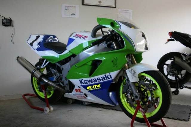
- Attachments
-
- small1280PICT9874.JPG (50.31 KiB) Viewed 2316 times
Re: New paint scheme - suggestions?
Mon Jan 26, 2009 9:45 pm
ducati_paul wrote:Just whack your ELITE FITNESS sticker over the top of the Shell one! Job Done!
+1 Oh and maybe some black rim tape to break em up a bit... Otherwise
 as it is IMO
 Edit -- Maybe follow the blue back on the belly pan to acheive a larger logo without losing the white contrast stripe above....